THE 15 DESIGN PRINCIPLES:


|
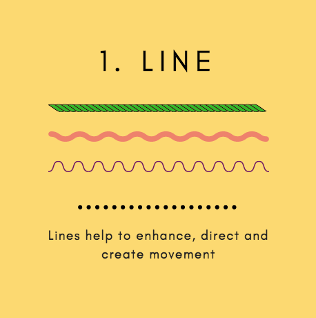
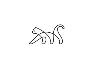
Lines can channel ideas. Some lines can evoke neatness or oder. Some lines evoke emotion such as excitement or tension. Lines can also lead your eye to certain elements in your design, or put emphasis on a specific object. Below, you can see an example of a linear design. The lines help your eye travel through the image and gives a neat look overall.
|
|
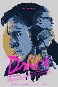
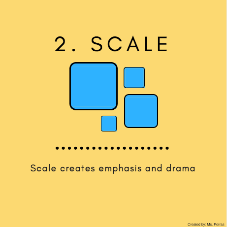
Scale helps viewers understand your work. You can size different parts of your design to signal which parts are important and which parts are less important. In the movie poster below, we immediately know who will be the most important character in the movie because the main actor's head is much larger than the rest.
|
|

|
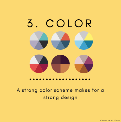
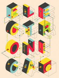
Color creates different moods, atmospheres, evokes feelings. Color is the most important part of your design!
In the example below, we look at a brand that uses soft, light colors to give a sense of elegance, calmness, and feminine appeal. 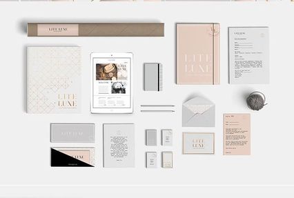
|
|
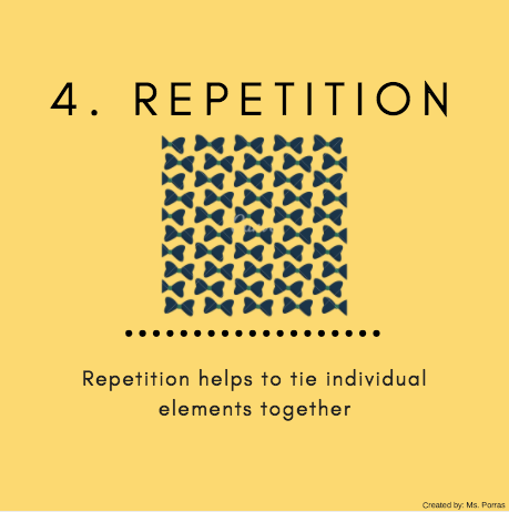
Repetition keeps your design consistent and ties your work together. Think of how Apple uses the same logo and general color scheme throughout all of their products; memorable, right? That's repetition.
Here's an example: 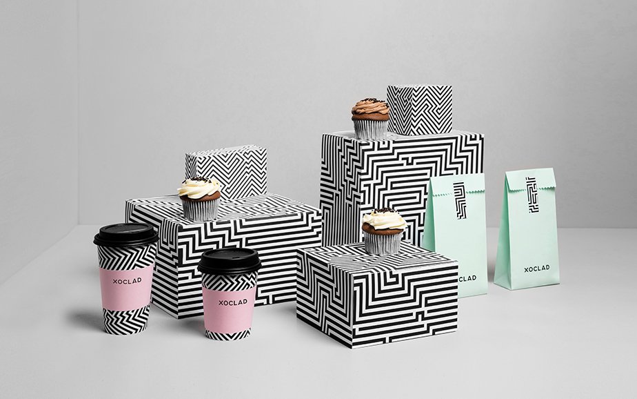
|

|
|
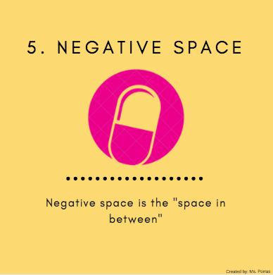
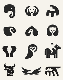
Negative Space is the area in between the shape that we immediately see. This area forms new shapes, and therefore adds to the complexity of the design. In the examples below, how many new shapes can you see from the negative space in each design?
|
|
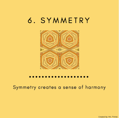
Human beings are inherently more attracted to symmetrical things. We tend to find symmetrical faces, patterns, and designs more beautiful and appealing.
The use of symmetry in logos is very common for its ability to create incredible harmony because it will attract consumers to buy their products. 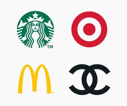
|

|

|
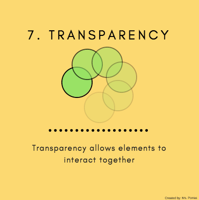
Transparency is also known as opacity. It refers to how "see-through" an object might be. The less opacity an object has, the less noticeable it is because it is more transparent. The more opacity an object has, the more noticeable it will be because it is less transparent.
In the example below, we see the artist has created layers of various transparencies. This helps the elements of his design tie together. 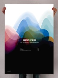
|
|
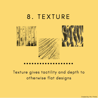
Texture is great to add depth and evoke senses, but needs to be used in moderation. Texture can create really interesting effects but too much texture can make your design look disheveled.
The texture used in the business cards below has the perfect combination of neatness and tactility. It creates a memorable design because people can literally feel the texture, but it does not overpower the look of the overall card. 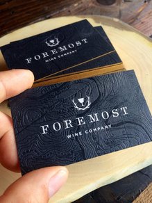
|

|

|
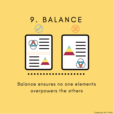
Think of the elements in your design as having a "weight". The text, images, shapes, color, etc. should be evenly distributed throughout your entire design. A good test to see if your design has good balance is if you printed out your design, would your design tip to one side? In the example below, we see the design has good balance because the size and even the shape of the cat seems to mirrors itself.
|
|
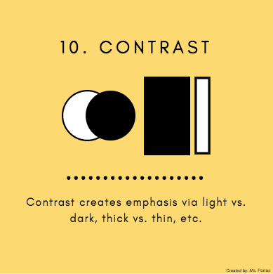
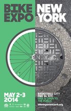
Contrast will make your design pop. Forms of contrast include pairing light vs. dark, thick vs. thin, and large vs. small elements together. Contrast has a great effect on the legibility and readability of your design. It is why you so often see books printed with black text on a white background. In the example below, contrast is used to separate ideas. "Bike Expo" is in a different color than "New York". Imagine if all the letters were the same color; it would be hard to understand the poster.
|

|
|
Framing helps draw attention to specific parts of your design.
You can use box outlines, graphic elements, or even real life objects to frame your design as seen in the example below. 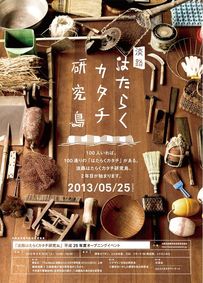
|
|
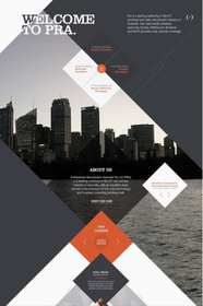
Direction refers to the manner in which the viewer's eye moves throughout your design. Usually, people will always read starting from the top left and scan the page in a "sweeping motion", sort of like reading. This is helpful to know when setting up your design, because you can always count on one location for your viewers to start understanding your design-- top left.
In the example below, the poster we see has the information spread throughout in a very organic way. The most important information, the title, is positioned in the top left and the rest of the information trickles downward in the direction of the instrument, allowing for a memorable viewing experience. 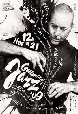
|
|

|
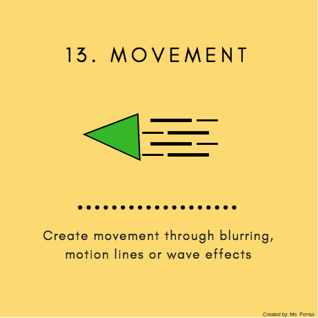
You can show "movement" in your design in a lot of different ways. We have already talked about direction, which helps guide your viewer through your design. Another way is changing the opacity, adding blur, or adding lines that depict motion.
|

|
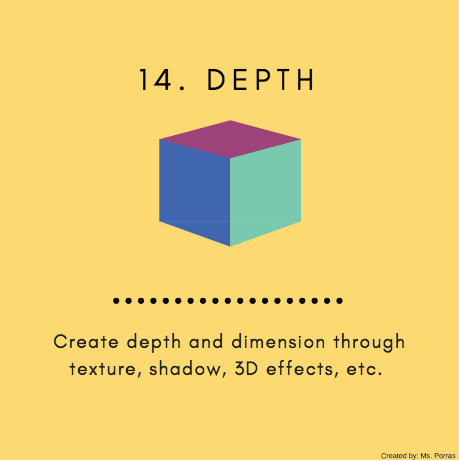
Depth can trick viewers into thinking your design moves beyond just the 2D-world. We can add depth to our design by adding shadows, overlapping objects, or changing the perspective.
|

|
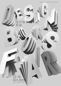
|
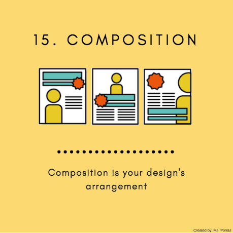
Composition means the way in which all of the elements in your design are arranged. It is where all of he past 14 principles we have discussed come together to make one, unified piece.
Some questions to ask yourself about your composition: --Is my design balanced? --Is there a main subject? --Does the eye follow the design over the page clearly and legibly? --Does my message/ intention of the design translate clearly to the audience? 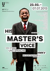
|
Resources: https://designschool.canva.com/design-elements-principles/
